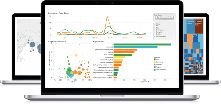
Tableau Projects
A sampling of projects from the Tableau Analyst certification track

As part of the Tableau Analyst Certification, I got the chance to do a number of interesting visualizations.
Retail example: Diving deep to address issues
For instance, we used a retail dataset to create both a dashboard that could show us how revenue broke down by region, category and sub-category. Additionally, we could visualize that same data as a map with the size of the circles indicating the level of sales and the color representing the profitability.
While the dashboard gave a sense of weight and importance of each of the regions and categories, it was not very helpful in drilling in on specific problem areas or helping us understand how we could take action to improve the business.


The map on the other hand allowed us to see, in great detail, how important various cities were in our regions by the amount of sales generated and allowed us to quickly identify areas that needed our attention.
For example, when we examine that map, we find that Istanbul is a fairly large market with sales of about ~$21,900, however, the profitability of our branch in the city is negative $19,961! That visualization prompted a deep dive into the business and we found that they were primarily selling a loss leader, bookshelves, and nearly nothing else. If this was a real life example we could take action to understand why the loss leader wasn’t working to attract other sales and make decisions to improve our profitability.
This type of visualization isn’t great for understanding the scale of the business but is great for finding areas to improve on.
Coffee shop example: Tracking goals and measuring success
Beyond just visualizing data for exploratory reasons, we can also build living dashboards that help us track and measure progress.
Within the Analyst track we worked with data from two fictional businesses, one a superstore and the other a coffee shop.
With Tableau we graphed our profit goals by category for each of the businesses on top of a chart actual profitability. Additionally, we color coded the underperforming categories in a bright orange so they would easily stand out. Here we have also added a filter to subset the data by region, hopefully making it more actionable for regional managers.
In the coffee store example we can see that Green Tea is underperforming the profitability goal in the East. This is data a manager could take action on.
